

I made this case study during the Google UX Design Certificate. My mission was: "Design a mobile ordering app for a grocery store in your hometown". Despite a solid self-taught experience in creating mobile apps from scratch, this case study taught me what the job of a Product Designer really is, and I loved it!
Product Designer
Conducting interviews, paper and digital
wireframing, low and high-fidelity prototyping,
conducting usability studies, accounting for
accessibility, and iterating on designs.
July 2022 - August 2022

During this certificate, I followed the design process taught by Google to design this project from concept to completion.
Empathize
Begin the design process for our product! We will focus on empathizing with users, which is the first phase of the design process. We’ll conduct interviews with real users to build Empathy Maps and create Personas. These will help us understand user perspectives and Pain Points.
Define
All of your work to empathize with users will help us define the problem that users are facing. Here we’ll move from the empathize phase into the define phase of the design process. To define the problem our designs will solve, we’ll build a Problem Statement, a Hypothesis Statement, and a Value Proposition.
Ideate
Move into the third phase of the design process: ideate. We’ll consider everything we have learned about the users we design for and the problems they’re facing in order to brainstorm ideas for design solutions. To help us come up with lots of ideas for design solutions, we’ll conduct a Competitive Audit and complete design activities, like How Might We and Crazy Eights.
Prototype
The next step in the UX design process is to create Wireframes and Prototypes. This gives us something tangible to test on real and potential users, which is crucial in making sure that our designs are usable.
Test
Like User Research, Testing is a fundamental part of the UX designer’s job and a core part of the overall UX design process. UX designers test because it allows them to improve upon the original product or site design and to see if the changes they made during the ‘design’ phase stand up to scrutiny. It’s a great way to eliminate problems or user difficulties that were unforeseen in the design phase before getting started on the implementation phase.
We design for users, they must be at the center of our attention from beginning to end in the design process.
For my first case study of this UX Design certificate, I found it interesting to have to design a mobile app for ordering groceries. From a user point of view, it’s amazing to be able to have groceries delivered to your front door in just a few taps on a mobile app. From a design perspective, it's a real challenge to make these apps simple to use and help users easily find the item they're looking amongst the large amount of items.
I eagerly accepted this challenge.
Despite the large number of competitors in this market (Uber Eats, Doordash, Amazon Fresh, Getir, Instacart, etc.) I didn’t want to create a “Me-too” product. I studied competing products in order to find a gap in the market and proposed an innovative solution. I then conducted interviews with users who buy their groceries online to better understand their needs and frustrations.
The interviews I conducted showed me three main Pain Points:

Time: Someone who has a full-time job and a family doesn't necessarily have the time or inclination to go to the grocery store.
Health: People with allergies, or those who pay close attention to their diet, don’t have enough information about what they’re eating.
Accessibility: Competing apps aren’t always well suited to people with sight problems or language difficulties.
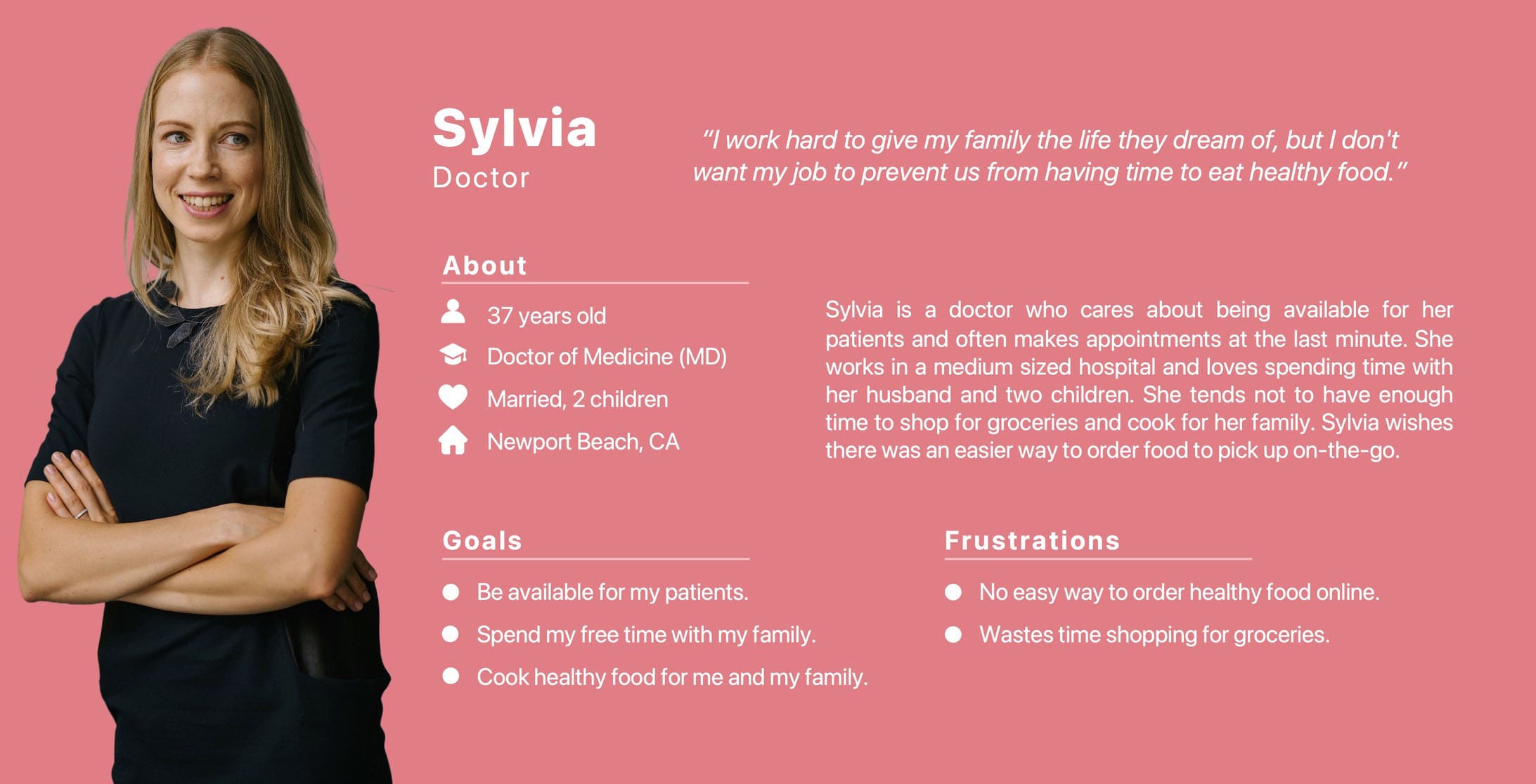
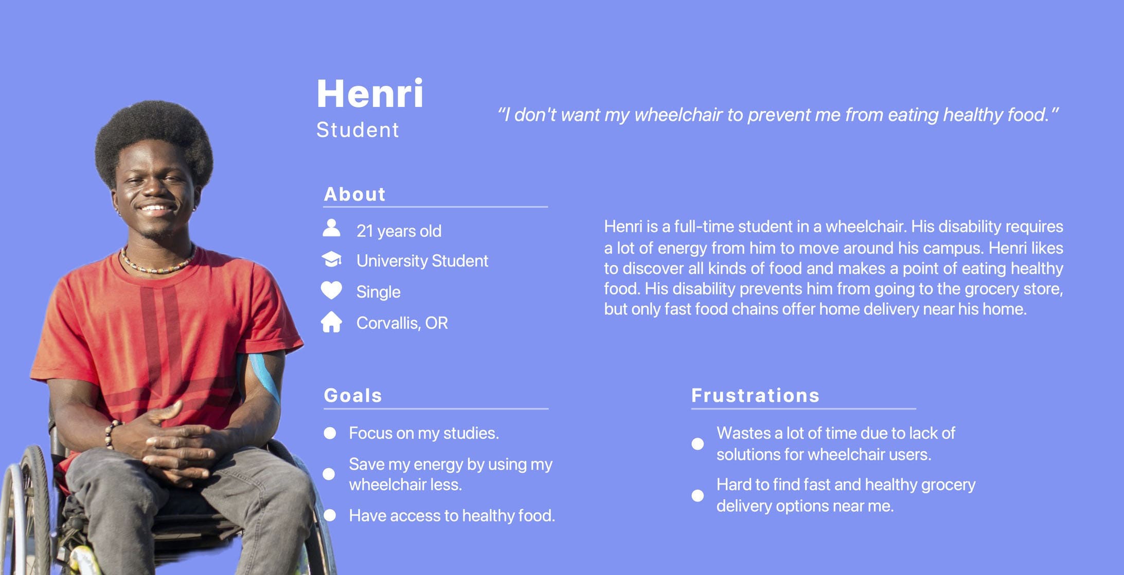
I created two personas to make these Pain Points come alive: Sylvia, a busy doctor who wants to buy healthy food for her family and, Henri, a student in a wheelchair.
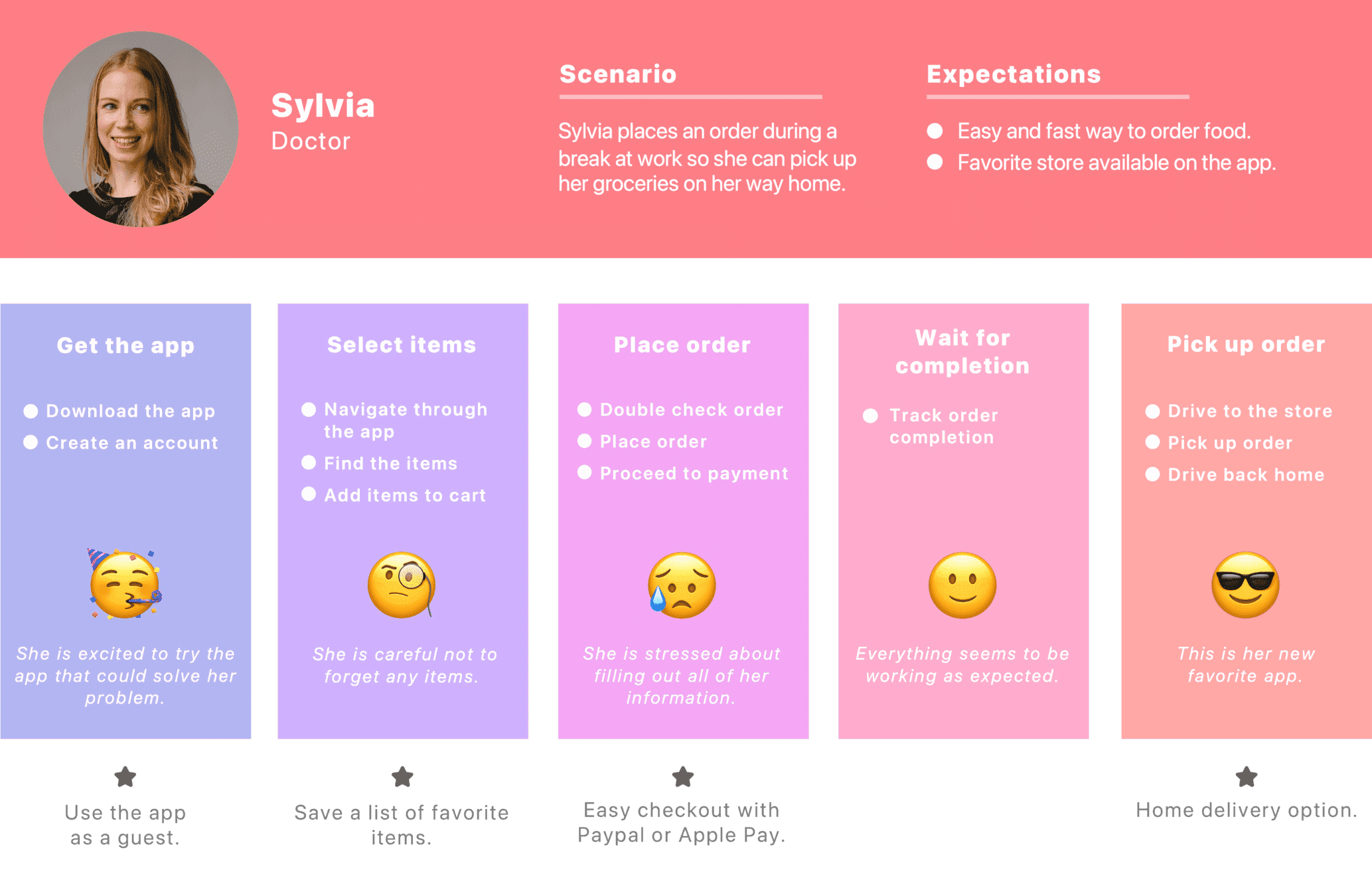
I created a User Journey Map focusing on Sylvia's persona.
During this step, I discovered new opportunities.
The first opportunity was to use the app as a guest user. This feature avoids having to create an account during the first order.
It's therefore a time saver if a new user is in a hurry, or just wants to take a look at the app before actually using it.
The second was to create a shopping list to make recurring orders.
I then tried designing this feature but in the end, I made some changes. 😉
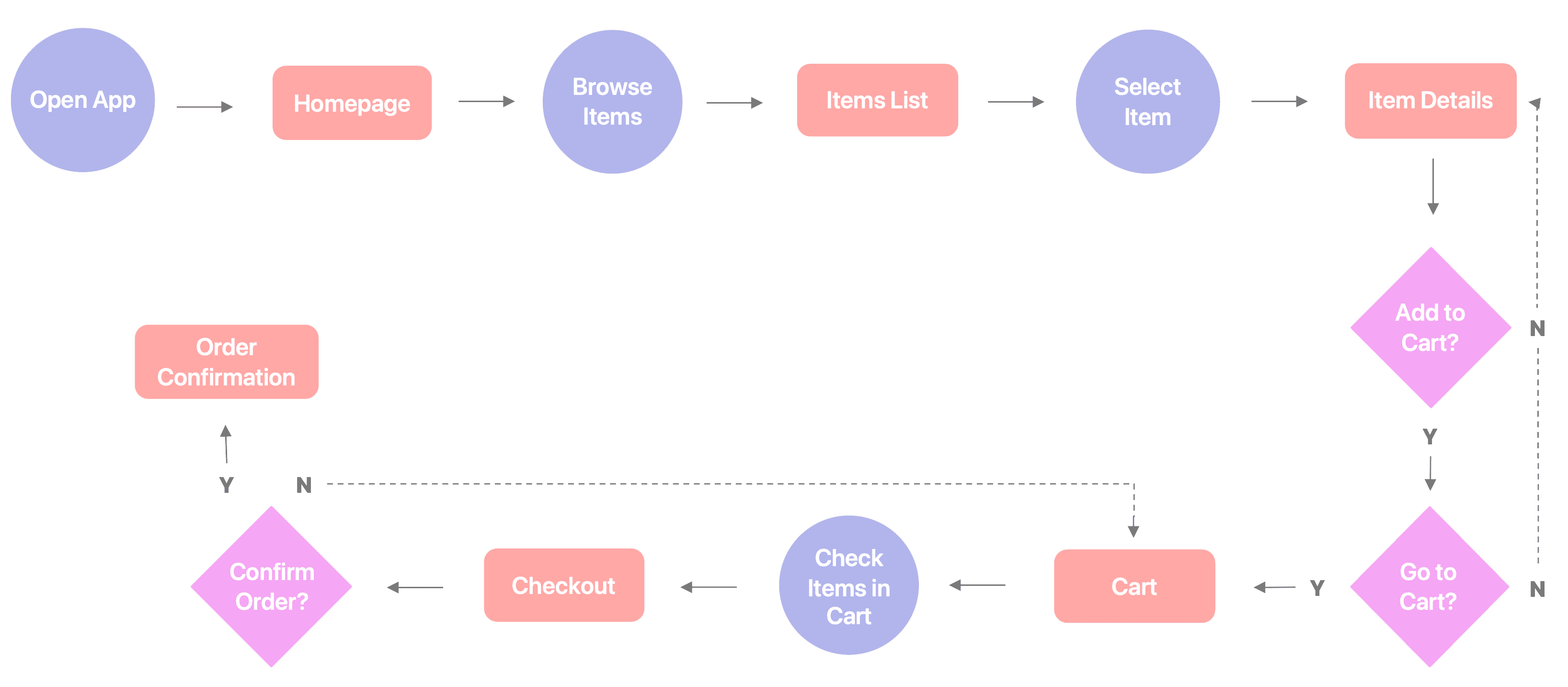
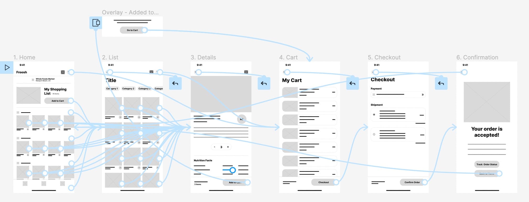
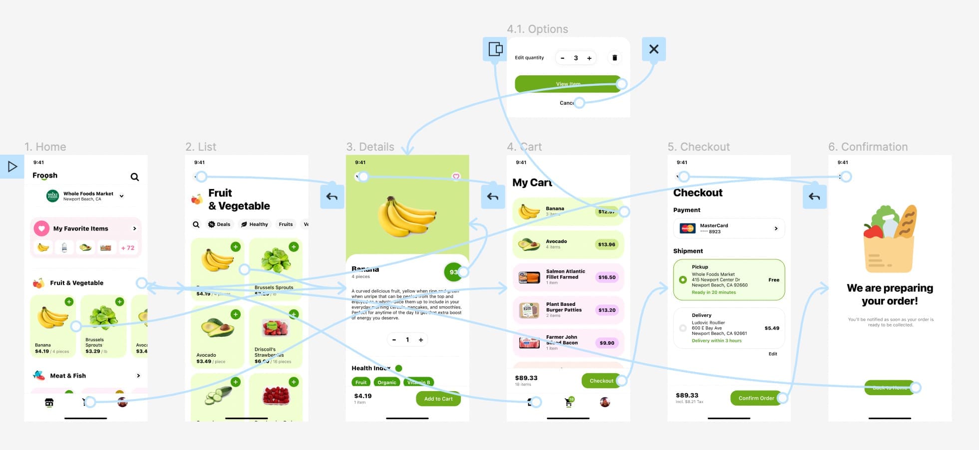
This is the main User Flow of browsing items and ordering groceries.
After thinking about what the main User Flow should be, I started the Paper Wireframes to have a clearer idea of what the final interface should look like. The Paper Wireframes stage is an effective way to test different solutions and iterate quickly. Even though it's a draft on a piece of paper, this step gave me the feeling that the app was becoming real.
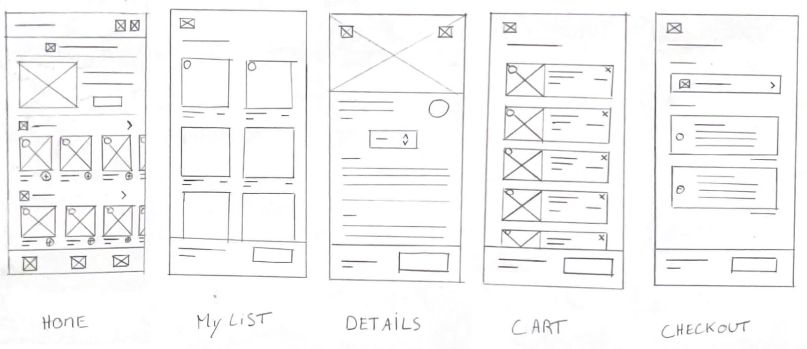
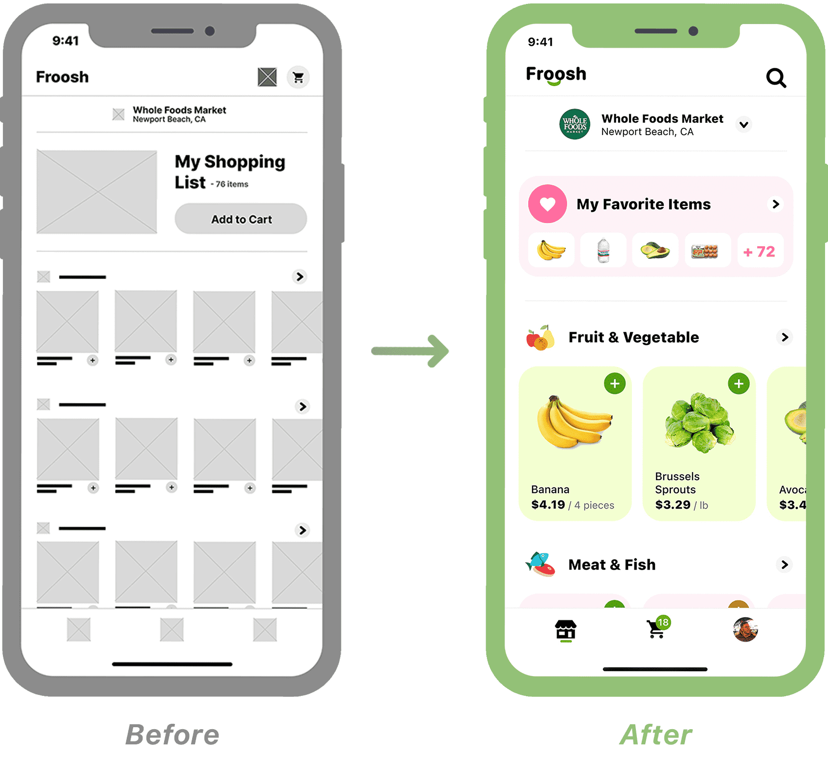
Home: I designed a shopping list to make recurring orders easily and quickly. What’s innovative about this feature is that the entire shopping list is added to the cart. The user is therefore not worried about forgetting an item, and doesn’t waste time adding items one by one to their cart.
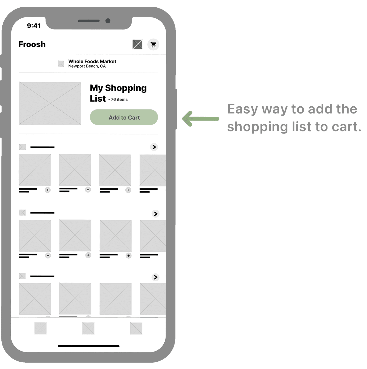
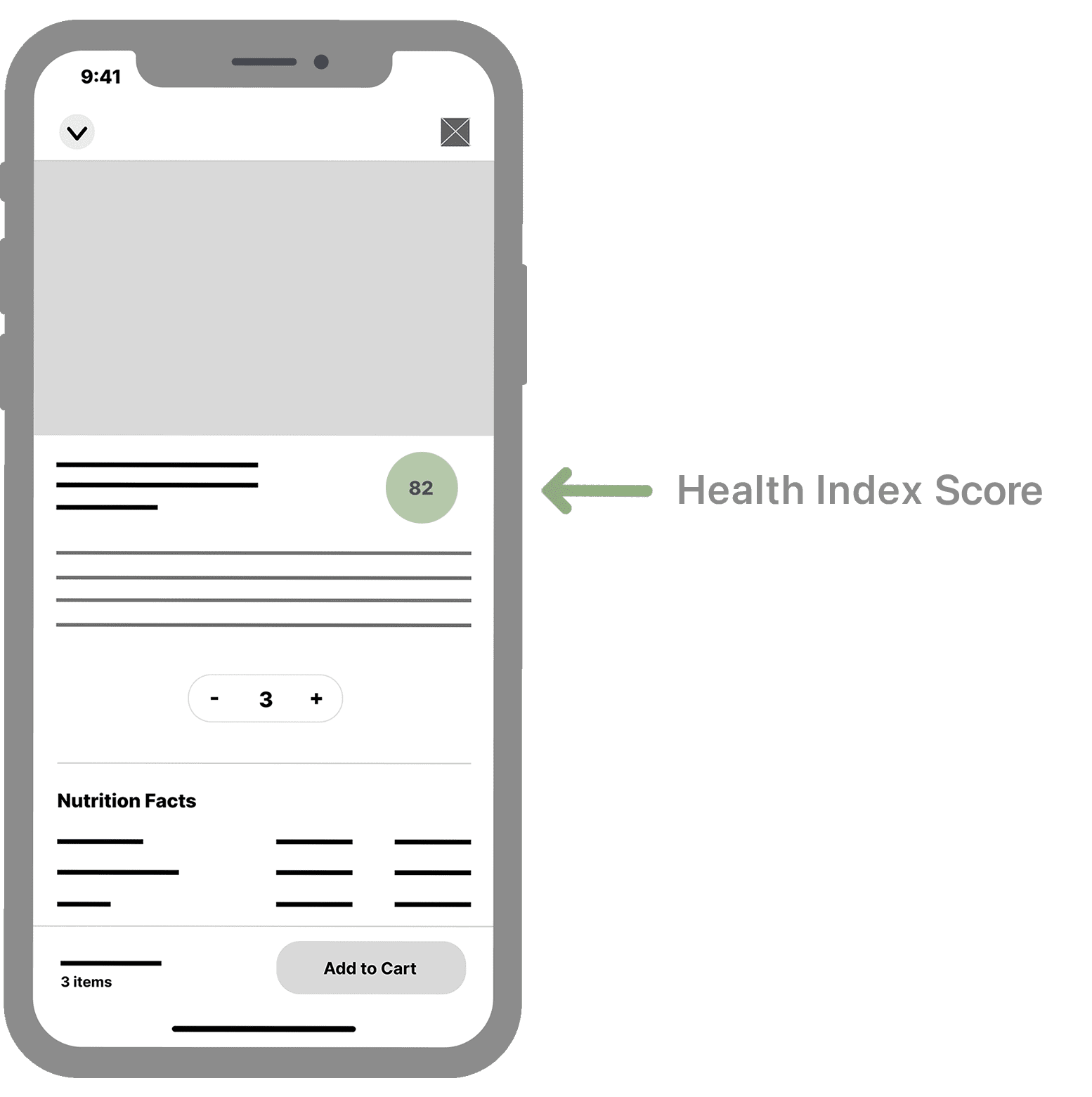
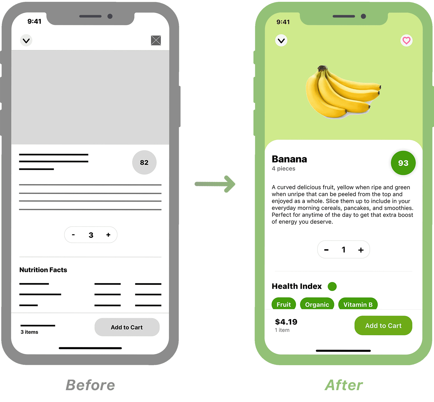
Details: I designed what I call the “Health Index Score”. It's a number given to each food according to its nutritional facts, its allergens and if it's an organic and local product. This score allows the consumer to know if they're eating healthily without worrying about reading all the information.
The Low-Fidelity Prototype connects the main User Flow of item browsing and grocery ordering, so the prototype can be tested in a Usability Study with potential users.
I conducted two rounds of Usability Studies. The results of the first study helped guide designs from Wireframes to Mockups. The second study used a High-Fidelity Prototype and revealed which aspects of the mockups needed to be refined.
I first wrote a Study Plan and then prepared a notes spreadsheet to record all the observations acquired from the candidates.
For the first round, I selected 5 candidates for an unmoderated Usability Study on the Low-Fidelity Prototype. Candidates had to access their shopping list and add it to cart. Then, they had to complete the checkout process. Not all candidates liked the shopping list because they rarely order the exact same items each time. On the other hand, the rest of the application seemed to work well.
Later in the design process, and after implementing the results of the first round, I did a second round with 5 new candidates for an unmoderated Usability Study on the High-Fidelity Prototype. This time the candidates didn't see any alarming issues, but they found a few relevant details which I quickly corrected.

Home: The first Usability Study showed me that users didn't like the idea of adding their entire shopping list to the cart. So I replaced this list with a list of favorite items. It simplifies access to items that users buy regularly and they can manually add them to the cart according to their needs.
Details: During the first Usability Study, users liked the idea of the Health Index Score but asked for more clarity about what this score means. The user now has access to all the details concerning the score (origin of the food, organic, nutrition facts, etc.).
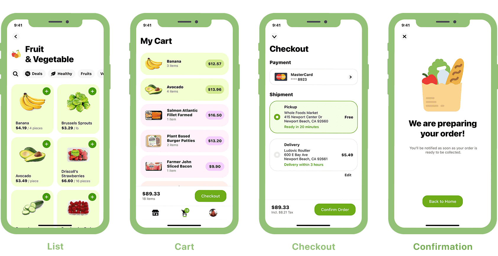
At this stage of the design process, Froosh looks and behaves as it should in production. I designed a Sticker Sheet to help me be more consistent with components, fonts, and colors.

Talking to the user is even more important than I had thought. We all come from different backgrounds with different life experiences. We all have a different perspective on society and the world. The more a UX Designer speaks to users, the more their work will be inclusive and representative of society. As Google says in its certificate, "don't let your personal biases influence your work".
I also learned that even in a crowded market like food delivery, it's always possible to find a gap and create a product that can change people's lives.
We are what we eat. If we can help people be more aware of what they consume, it can be a game changer for their personal health and the health of society.
For those who are already careful with their diet, our work is to make access to healthy food easier and more affordable.