

I made this case study during the Google UX Design Certificate. My mission was: "Create a balance transfer flow for an online bank". Being used to design on mobile devices I struggled to figure out how to take advantage of the larger screen size, but after several attempts, I'm proud of the end result.
Product Designer
Conducting interviews, paper and digital
wireframing, low and high-fidelity prototyping,
conducting usability studies, accounting for
accessibility, and iterating on designs.
September 2022

During this certificate, I followed the design process taught by Google to design this project from concept to completion.
Empathize
Begin the design process for our product! We will focus on empathizing with users, which is the first phase of the design process. We’ll conduct interviews with real users to build Empathy Maps and create Personas. These will help us understand user perspectives and Pain Points.
Define
All of your work to empathize with users will help us define the problem that users are facing. Here we’ll move from the empathize phase into the define phase of the design process. To define the problem our designs will solve, we’ll build a Problem Statement, a Hypothesis Statement, and a Value Proposition.
Ideate
Move into the third phase of the design process: ideate. We’ll consider everything we have learned about the users we design for and the problems they’re facing in order to brainstorm ideas for design solutions. To help us come up with lots of ideas for design solutions, we’ll conduct a Competitive Audit and complete design activities, like How Might We and Crazy Eights.
Prototype
The next step in the UX design process is to create Wireframes and Prototypes. This gives us something tangible to test on real and potential users, which is crucial in making sure that our designs are usable.
Test
Like User Research, Testing is a fundamental part of the UX designer’s job and a core part of the overall UX design process. UX designers test because it allows them to improve upon the original product or site design and to see if the changes they made during the ‘design’ phase stand up to scrutiny. It’s a great way to eliminate problems or user difficulties that were unforeseen in the design phase before getting started on the implementation phase.
We design for users, they must be at the center of our attention from beginning to end in the design process.
For this second case study of this UX Design certificate, my mission was to design a balance transfer flow for an online bank. In addition to designing the transfer flow, I thought it would be interesting to design the main features of an online bank.
From my personal experience and with the research I have done, banks can be old institutions that are unfamiliar with internet standards. The user experience can sometimes be unpleasant or even difficult to use for the less tech-savvy. All categories of people are likely to use an online bank, so it's important that the interface is accessible for everyone.
Vault operates like a French/European bank, so don't be surprised if there are some differences with your local bank.
For this case study, I read hundreds of reviews left on the App Store by customers of the main French banks (Crédit Agricole, Crédit Mutuel, Caisse d’Epargne, N26, and Boursorama Banque). These reviews showed three main Pain Points:

Difficulty: A lot of users complained about the difficulty of using current banking websites. It's not always easy to find the information they want. The less tech-savvy are afraid of making a mistake that will cost them their savings.
Multi-Profile: Many users have to manage someone else's bank account. This could be a child, an elderly person, a person with a disability, etc. Managing multiple user accounts is often poorly designed. The website either asks for a password too often, or the website mixes up the account balances of all users.
Budget: Users would like the bank to help them manage their budget. By highlighting detailed statistics of their spending, users could easily find out where they need to save money.
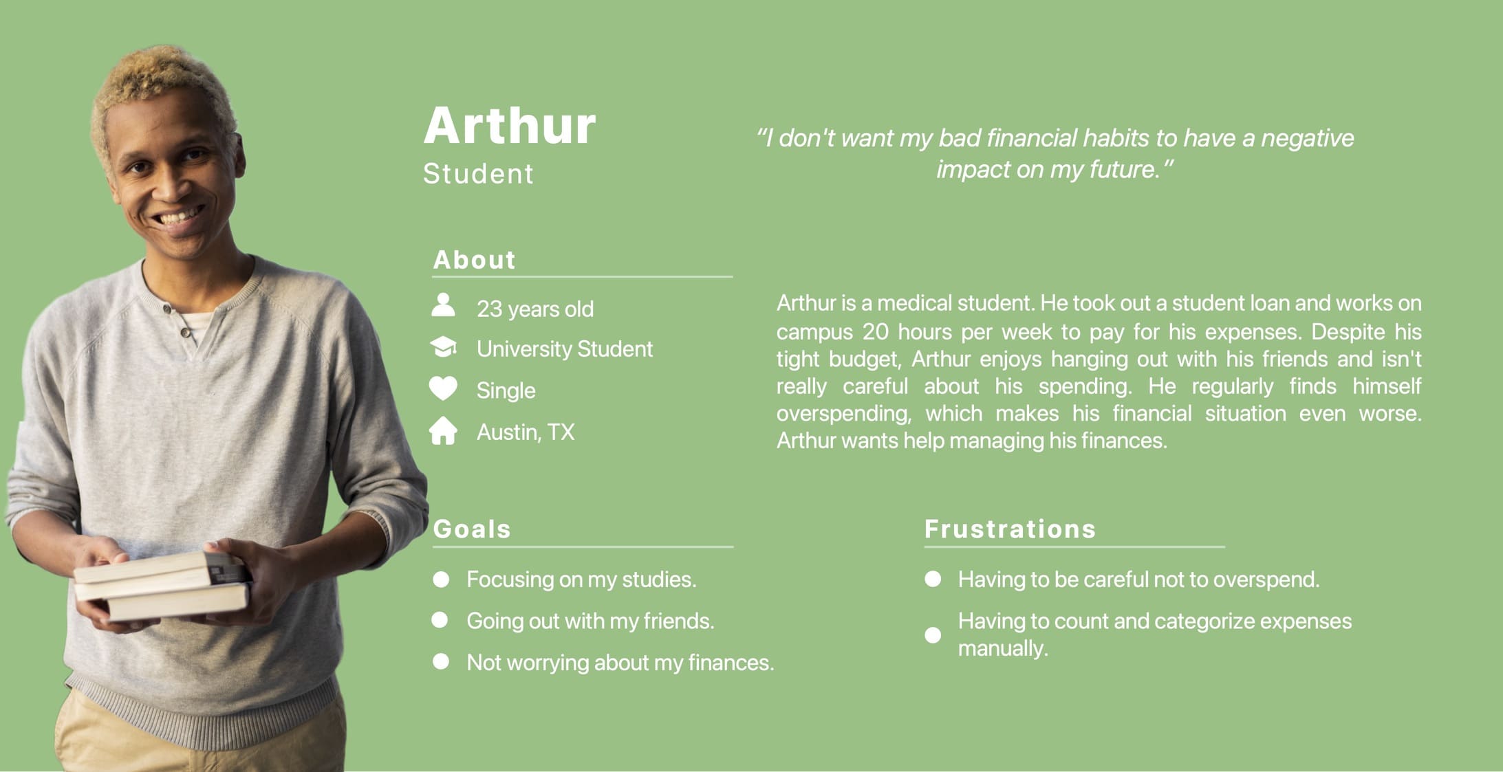
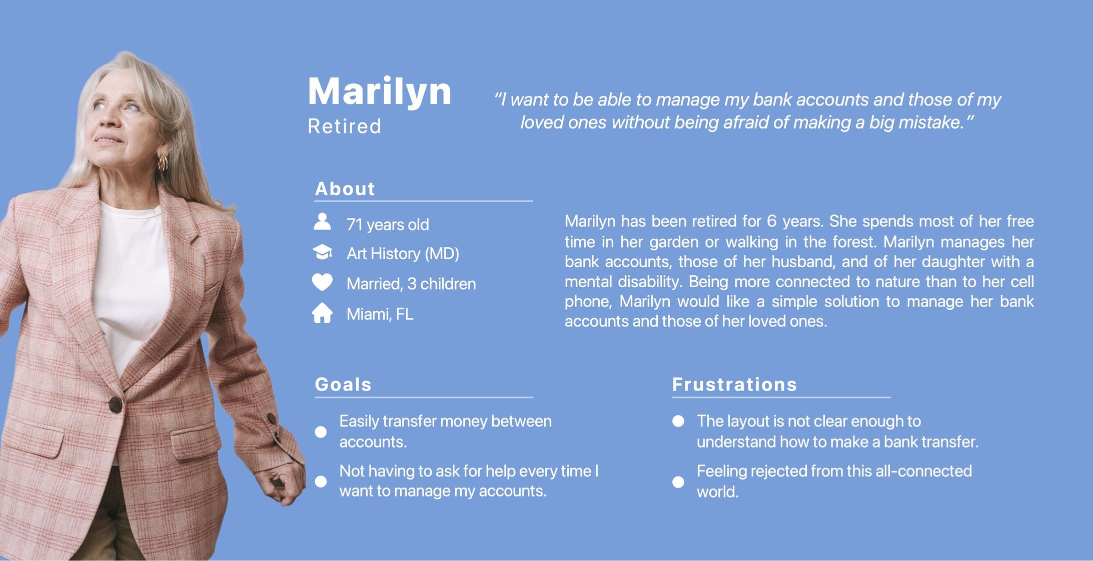
I created two personas to make these Pain Points come alive: Arthur, a student with a tight budget and, Marilyn, a retiree who wants a simpler solution to manage her bank accounts and those of her loved ones.
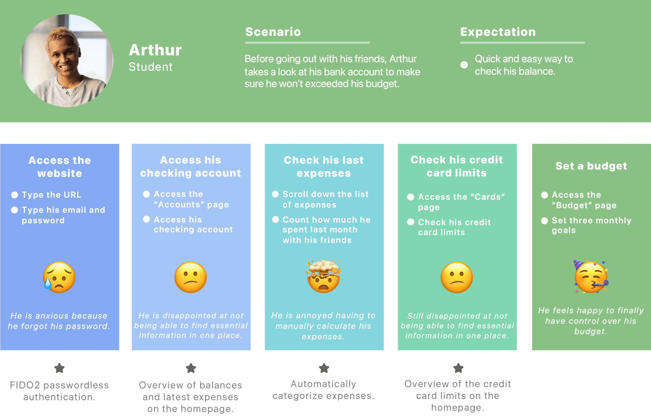
I created a User Journey Map focusing on Arthur's persona.
During this step, I discovered new opportunities.
The first opportunity was to use the FIDO2 passwordless authentication. This technology makes it possible to use Touch ID, or any other means of logging in without a password via a web browser. Thus, there is no need to enter your password each time you login. It's a time saver and one less thing to worry about.
I then understood how crucial it was for Arthur to find a summary of all the important information directly on his homepage.
I also imagined a page dedicated to budget management. It's rare that a bank offers solutions for better control of our budget, shows recommendations and detailed statistics. That's why I will try to innovate by designing this feature.
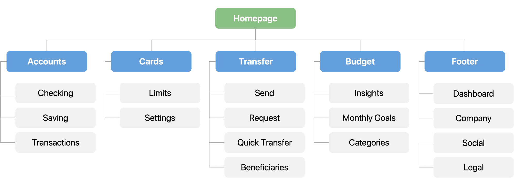
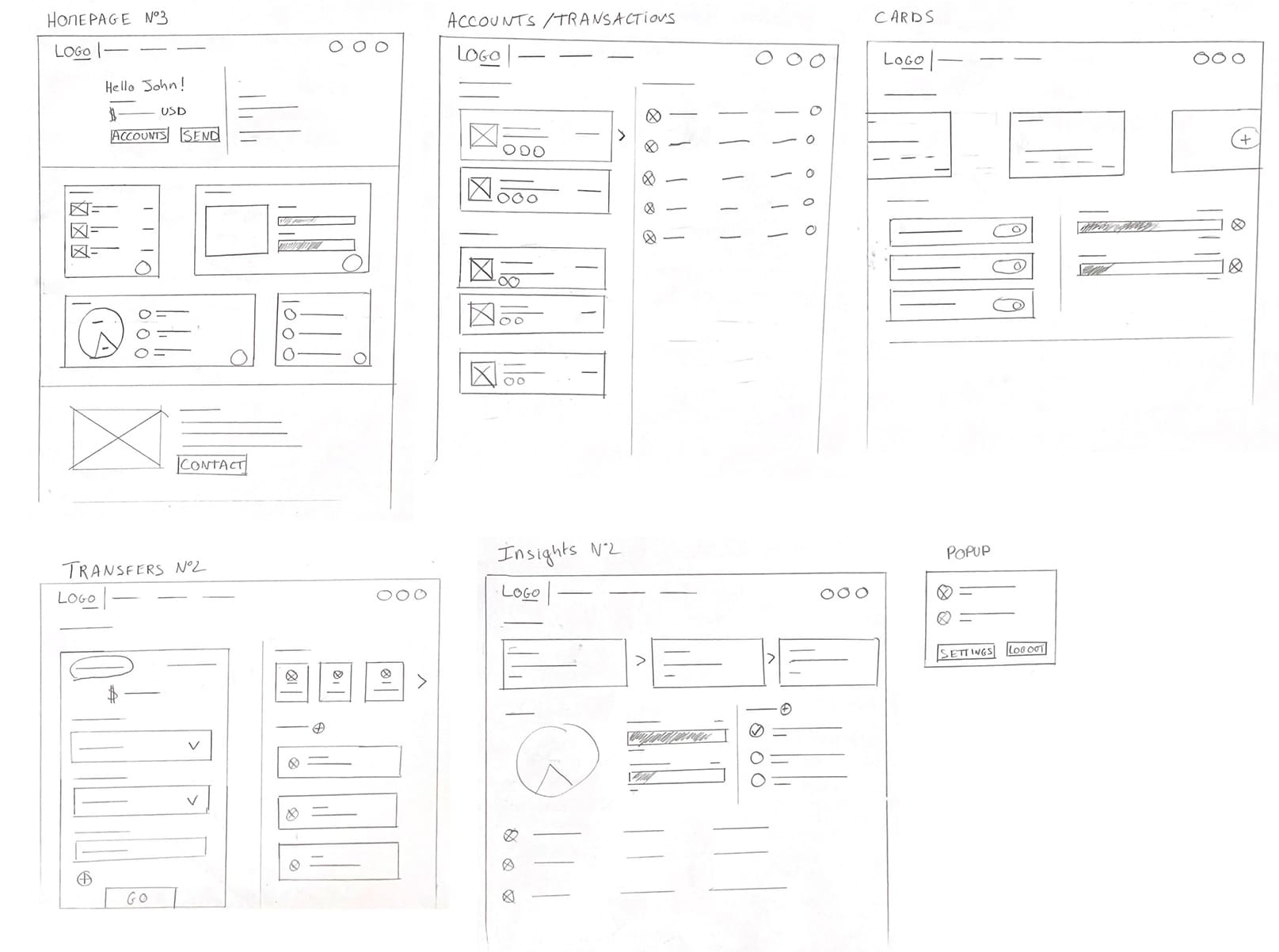
After studying user Pain Points and defining a Sitemap, I started the Paper Wireframes to have a clearer idea of what the final interface should look like. At first it was difficult for me to design an interface the size of a desktop screen, as I'm more used to creating mobile apps. However, I managed to create a decent version in the end.
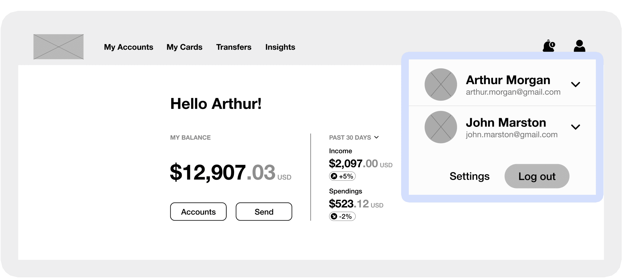
Multi-Profile popup: In order to simplify the management of other people's bank accounts, I thought of a simple solution allowing the user to quickly switch profiles. If a user gives you access to their profile, it will appear in this popup. The user will then be able to access the profile of this person and manage their bank accounts without having to enter a second password. Each profile is distinct, no information is shared between them.
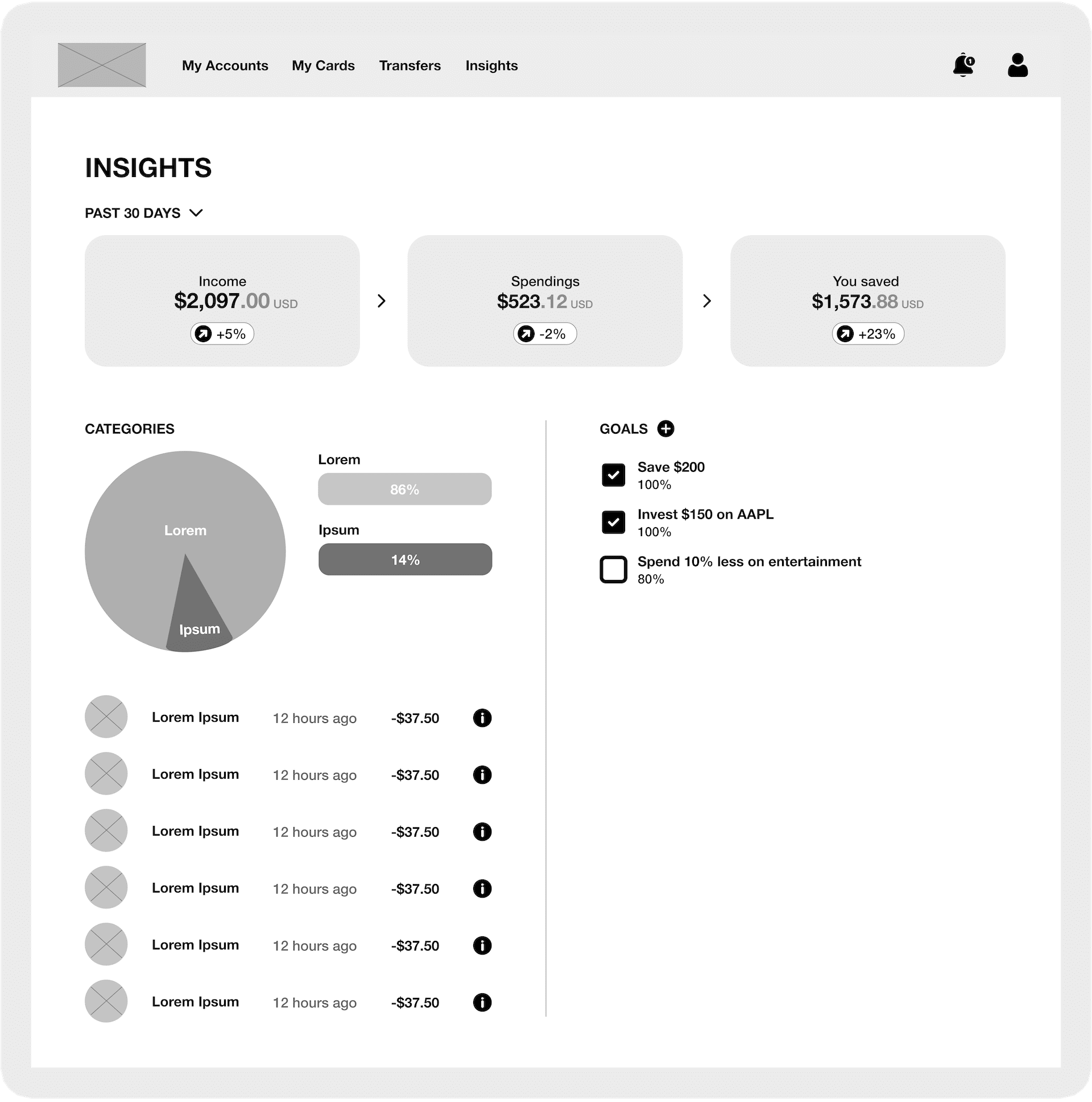
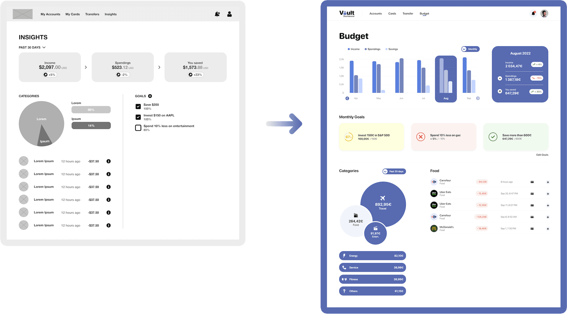
Budget: One of the main objectives is to make budget management more accessible to users. I designed a Budget page to display income, expenses and savings made by the user. Each expense is automatically categorized, which helps the user know where to change their spending habits. They can also set monthly goals to make managing their budget more accessible.
To create the first version of my Low-Fidelity Prototype, I connected all of the screens involved in the main User Flow of managing accounts to balance transfer.

I conducted three rounds of Usability Studies. For each study, I first wrote a Study Plan and then prepared a notes spreadsheet to record all the observations from the candidates.
For the first round, I selected 5 candidates for an unmoderated Usability Study on the Low-Fidelity Prototype. Candidates had to navigate through the website and transfer money. They didn’t like the UI of the homepage and the transfer flow wasn't simple enough.
For the second round, I redesigned the homepage and the balance transfer flow to make the site easier to use. I selected 5 candidates for an unmoderated Usability Study on a second version of the Low-Fidelity Prototype. The candidates were much more satisfied with this new design. They found some improvements to be made, but no major changes.
Later on in the design process, I did a third round with 5 new candidates for an unmoderated Usability Study on the High-Fidelity Prototype. This time, the candidates didn’t find any issues, and were even pleasantly surprised by the accessibility of the website.

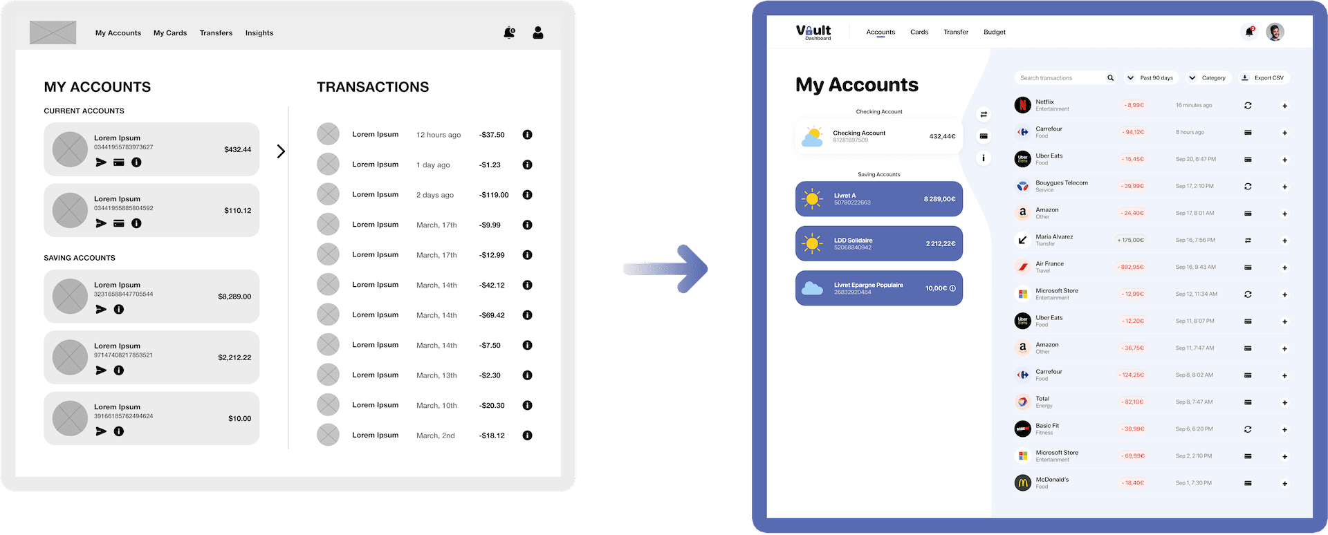
Accounts: During the first two Usability Studies, users wanted to have more possibilities to filter or search for past transactions. It's now possible to filter transactions by date and category, and use the search bar.
Budget: During the first Usability Study, users liked the Budget page, but most said that this feature could be improved. This is why it's now possible to see your income, expenses and savings month to month. The interface has also been redesigned to be more aesthetically pleasing.
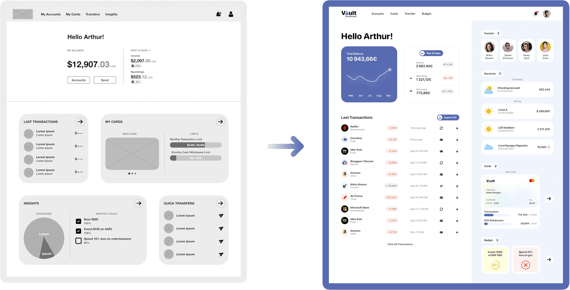
Home: During the first Usability Study, the candidates all said that the desktop screen size was poorly optimized. I then decided to redesign this page by separating the screen into two parts to better arrange the content. Every essential information is now accessible via the homepage.
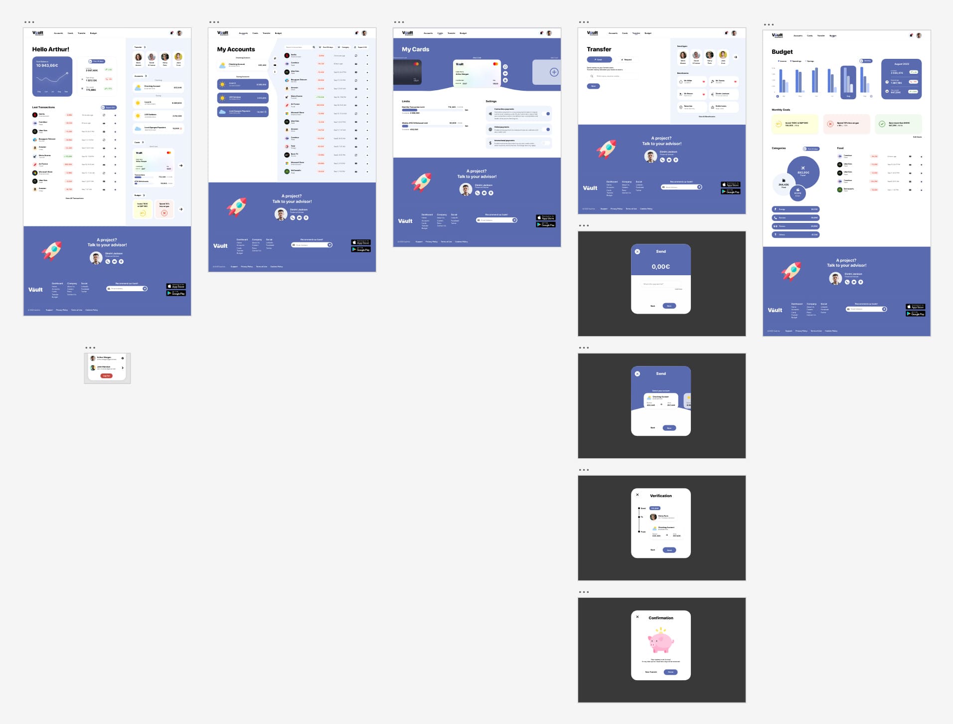
I used my findings from the Usability Studies to design the High-Fidelity Prototype. At this stage of the design process, Vault looks and behaves as it should in production.

Talking to users was crucial. The research I did by reading user reviews from other banks gave direction to my project. Usability Studies allowed me to refine this direction to best meet the needs of users.
Designing a website showed me the importance of the user interface. A clear and concise interface allows users to better process information and not feel overwhelmed.
The challenge was to create a simple design that could be used by all categories of people. The solution to this challenge was simplicity.
In today's world, people with less knowledge about technologie can feel easily disconnected from the world. If we want these people to feel connected, we must make technology accessible to everyone. It all starts with a great user experience.
Easy access to our finances is crucial, making this accessible to everyone is even more so.